


Pinewood Forest is a fictional area of natural beauty and visitor attraction. The aim is to mock up a web design to showcase the forest, what it has to offer and inform visitors of upcoming events.
We’ll be creating the design based on a sophisticated style with subtly textured elements and serif fonts. The background will feature a large static background image that allows the main content to scroll over it, and the content itself is broken up into key focus areas with photography used to draw in the user.In this first part of the site build we’ll go through the Photoshop stage and mock up the design concept for the homepage, stay tuned this tutorial when we’ll finish off the homepage into a fully coded webpage in HTML and CSS.
Begin by creating a new document. I tend to create a canvas size at a typical large monitor resolution. With this design featuring a large background image we want to accommodate even the larger resolutions used by 24 or 27 inch monitors.
Transform a marquee selection to 960px and drag guides to identify this portion of the page, this will be where the main content will be contained.
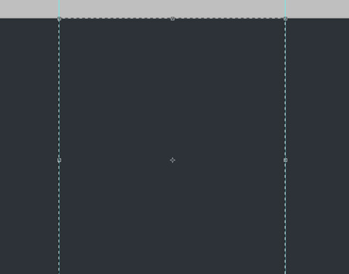
Import a photograph for use as the large background image and scale to fill the majority of the screen, but leave a thin margin at either side. Drag a guide to identify a typical fold line for a large monitor resolution, say around 1920px. This particular image I have downloaded from ThinkStock, which was also the source of the range of blue and grey tones.
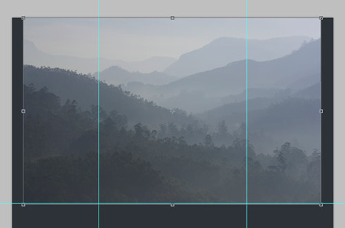
Add a Layer Mask to the photograph and use a range of Watercolor brushes to fade out the edges. Drop the opacity of your brushes to create a cool layered and textured appearance where the image blends into the background.
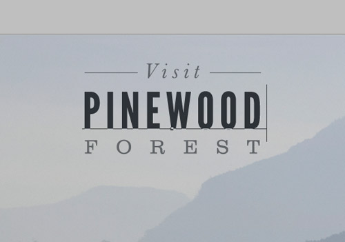
Create a logo for the forest and place it centrally in the header area of the page. Adjust the sizing of the fonts so the focus is on the word Pinewood, but align the two words by increasing the tracking on the word forest. A mix of sans-serif (League Gothic) and serif (Clarendon) works really well to combine the styles of modern and traditional.
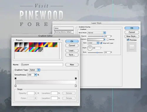
Add a Drop Shadow and Gradient Overlay layer style to the logo. Both effects add depth by lifting the logo from the page and giving it more prominence. Keep the contrast between the gradient and the opacity of the shadow low to maintain subtlety.
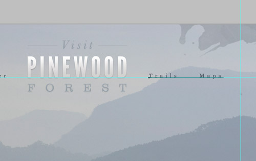
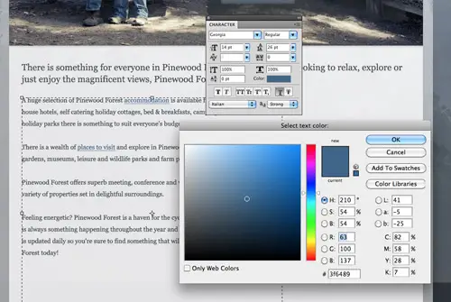
Type out some navigation items to sit either side of the logo to form a menu. The serif Georgia font is a web safe alternative to the Clarendon typeface used in the logo, without needing any special web font treatment. The tracking in the design concept can be matched with CSS letter-spacing.
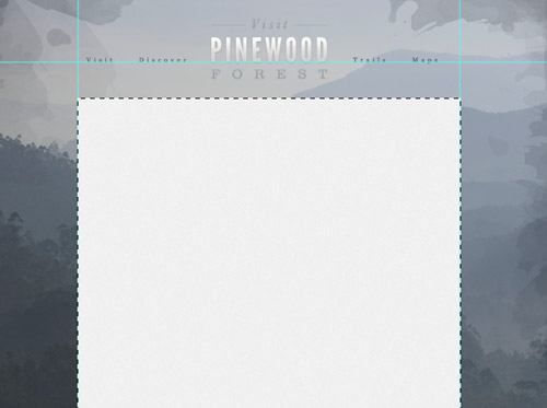
Draw a large rectangular selection to outline the content area within the 960px guides. Fill this rectangle with a light grey colour selection from the logo’s gradient.
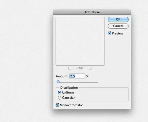
Add a subtle Noise texture (Filter > Noise > Add Noise) of around 2.5% to give a tactile feel to the content panel.
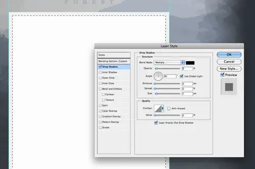
CMD-click the layer thumbnail of the content panel, then right click and select Transform Selection. Adjust the width and height to 40px smaller in size and fill the selection with white. Add a subtle Drop Shadow to lift the white panel from the grey border.
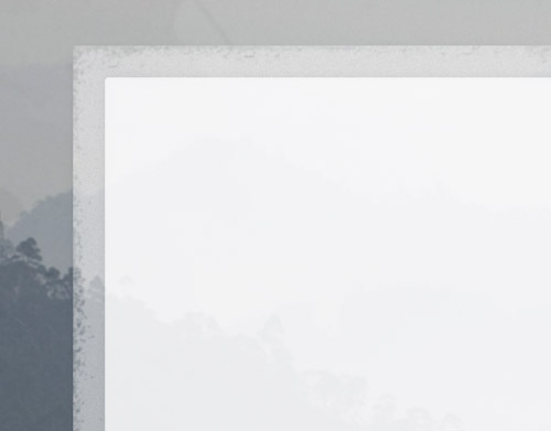
Use a selection of paint roller brushes to rough up the edges of the grey border by painting onto a layer mask. Load the selection of the white panel and fill this area black on the layer mask to render it transparent, then drop the opacity of the grey border to around 60% to allow the photographic background to show through.
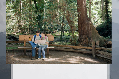
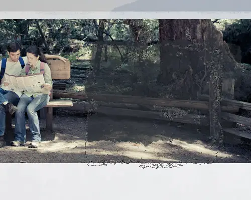
Import a photograph to use as a background of the main feature area on the page. Draw a thin rectangular marquee selection to match the content panel, inverse the selection and delete out the excess from the photograph.
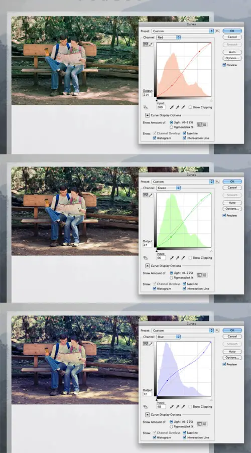
The colours of the photo don’t really match the overall scheme of the website so make some adjustments with the Curves tool. Bend the Red and Green channels into very slight ‘S-bends’, then tweak the blue channel with an inverted ‘S’ shape.
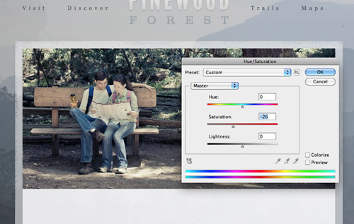
Decrease the saturation of the image to tone down the colours, the result is a colour cast on the image that matches the cool blues and greys of the surrounding design.
Use one of the paint roller brushes from Colorburned to paint in a background for some text in the feature area.
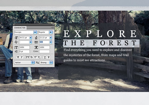
Tweak the size and tracking of the title text to create a cool typographic header, then set the following paragraph as typical 14px body text.
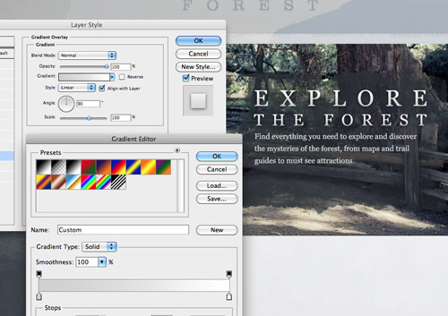
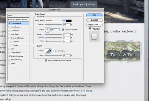
Similar layer styles to those used on the logo will help boost the impact of the header. Add the grey to white gradient overlay and subtle drop shadow.
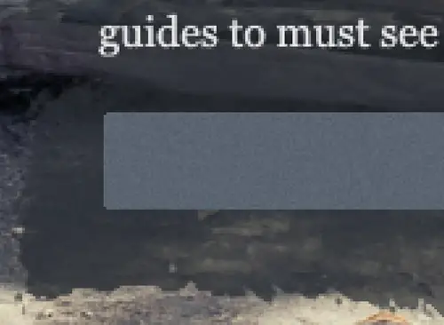
A clear call to action button will give casual browsers clear direction of where to go next from the homepage. Draw a thin rectangle and fill it with a blue colour swatch from the scheme. Add a subtle noise filter to rough up the button a little, then use a 1px pencil setting on the Eraser tool to clip a little notch in each corner.
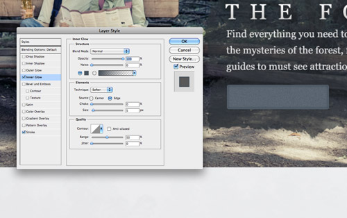
Add an Inner Glow to the button using a slightly darker shade of blue. Set the options to Normal blending mode, 100% opacity and adjust the size to suit. Also give the button a 1px stroke using a slightly lighter shade of blue.
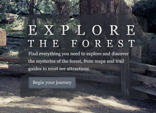
Finish off the button with a clear and descriptive message, them make sure all the elements of the feature area are neatly aligned.
Begin filling out the content area with body copy. Set the intro heading in a slightly larger font size and allow it to span across the full width. Align the smaller body copy into a two column layout, one wide column for the main content and a smaller column for the sidebar. Links will also need mocking up to show how they will be identified. Colour specific parts of the text with a lighter blue and add an underline.
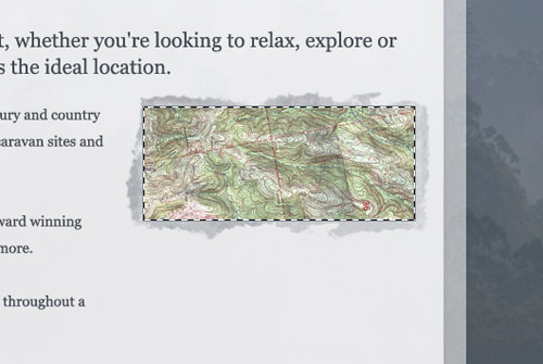
In the sidebar we’re going to make three mini-feature areas that would link off to other areas of the site. Each one will include an image, title and short paragraph. Add a textured background using the paint roller brushes then clip a map image down to size within this textured area.
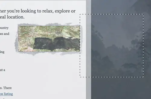
Use the paint roller brushes to create another background, this time using the darker blue to create a base for the title text. Trim off any overlapping areas to match the edge of the image.
Add a short title to the header graphic and give it the same treatment as the text in the feature section.
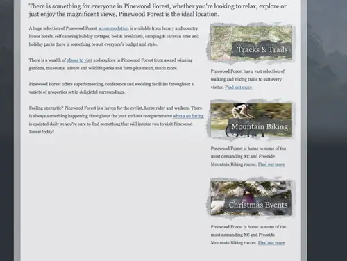
Group all the elements that form the aside feature in the sidebar, then duplicate the group and edit the content to form three separate feature areas.
Underneath the text in the main column we’ll add an ‘Upcoming events’ section. Use the already established font styles from the header and body text to lay out the content, then create a small date area using a selection from the grey border.
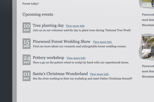
Each event is laid out with a date icon, title, more info link and short description. We can plan at this stage how this layout could be coding up with the relevant HTML elements, but you’ll have to wait until next week to see the step by step!
Here we have the finished concept. Next week we’ll go through the process of coding it up with HTML and CSS. Remember we’ll be keeping that large background image static so the outer portion of the image won’t be seen by most monitor resolutions. This also means all the centre content will have to scroll over the background image, so we’ll be calling upon lots of PNG-24 graphics to use their alpha transparency.
